
-min.png)
Health systems have a unique opportunity to lead the next chapter of value-based care, and Conduce Health is at the forefront of that chapter. As a contractor, I designed a web prototype that predicts patient needs, matches patients with the right specialists for them, and optimizes specialty care networks.
The deliverables included user scenarios in documented from, as well as defined functionalities and interactive prototypes that were used to raise over $3 million in a seed round with investments from CT Innovations, AlleyCorp, Black Opal, and more.
In addition, Conduce Health was listed as 2025 New York Digital Health's 100 by Digital Health New York. Not too shabby!
Read about Conduce Health's recent achievements on Yahoo Finance.
I was the sole designer for this project and was allotted approximately two months of full time work for completion. Designs were meant to act as a proof of concept rather than production, with the goal of garnering positive sentiments during the first round of clinician impressions testing, as well as investor backing.
Alongside a few user interviews, I consolidated multiple research articles to understand the health system environment as it pertains to specialty care and referrals. I also drew from my own past experiences working in health tech settings.
I identified three abstract personas that fit into the health system ecosystem. Our product would interact with all three differently.
I began designing a wire frame representing the key inflection point for each of the different personas. I asked myself, "What information do clinicians wish they had when choosing a specialist?", "What is considered optimal vs sub-optimal referral?", and "How can we align our patient signatures with existing mental models of patient population categories?"
Upon presenting each wire frame to the team, I noted what the design succeeded in as well as areas for iterated improvement.
How are different stakeholders using and interpreting population information to make care decisions for their patients?

Visual indication of quantity, as well as distanced from optimized value.
Hidden information on hover state decreases visual complexity.
Unspecified driver behind cost makes data less actionable.
Other actionable information (type of procedures, in/out of network, distance, etc.) missing.

Patient signatures match existing mental model of how health directors think about their population.
Factors behind cost listed clearly in hover state with time.
Difficult to deduce how different population groups compare to each other, as well as which groups are contributing most to overall cost.

By distance, an important factor referral process, shown clearly by visual map.
Credibility established by comparing single patient to larger population outcomes.
Other important referral factors, such as availability and network type are unavailable.
Missed opportunity for decision feedback.
In addition to the areas of improvement identified previously, I found that re-organizing our user flow lead to a more cohesive exploratory experience. Initially, we had three distinct and separated user flows that mimicked the way we structured our database. This created an artificial segmentation of our differing personas.
We found that conceptually, it was more natural to organize features for the population health manager and chief medical officer persona into one, larger connected flow. The primary care provider flow remained minimal and segmented apart.


.gif)
Having persistent filters by population group avoids complex nesting issues and encourages exploration/information discovery.
Navigation tabs offers a high level summary of how differing population groups compare to each other, as well an in-depth breakdown of each individual group.
The primary care provider's user journey begins in their native EHR system, with the Mongoose solution as a plug-in to avoid extraneous platform switching. We give the provider the opportunity to act on our referral recommendation, or to dive into deeper context for their individual patient.
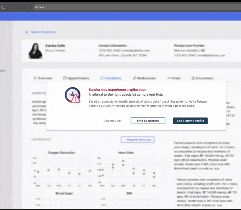
The individual patient is contextualized amongst similar population groups and outcomes, which establishes greater credibility to our recommendation.
.gif)
Not only is it important to contextualize what makes a good decision, credibility is also established by transparently showing what makes a sub-optimal referral.
"Vanessa Ta offers fantastic work by incorporating excellent visual design craft and communicating strong, user-centric, design justification."
- Harvard Pan, Chief Operating Officer
The project was a success after raising over $3 million in funding! I loved getting to work with Geoff Matous (President and CGO) and Harvard Pan (COO) on this project. Keep your eyes out on Monduce Health as they continue to refine their offering, they're one to watch out for!


.png)